Creating Seamless Patterns in Illustrator: Tips and Tricks
A good seamless pattern looks effortless, but anyone who has tried to align objects manually in Illustrator knows how quickly things can fall apart. A flower half cut on the border, a gap that isn’t visible until zoomed out, or repeated objects unintentionally clustering together — all small mistakes that instantly give away an unpolished pattern. Fortunately, once you understand a few core principles, the process becomes much more predictable and easier to control.
Understanding the Nature of a Repeat
Before opening Illustrator, it helps to have clarity on the type of pattern you’re aiming for. Some repeats follow strict alignment, while others appear more loosely arranged. Whether your elements are positioned in a straight grid or slightly offset to create a staggered rhythm, the logic behind the pattern must remain consistent so it repeats without interruption. The fundamental rule is simple: anything that touches one edge must reappear at the exact corresponding position on the opposite edge. If that alignment is correct, the viewer should be unable to tell where one tile ends and the next begins. This is what gives seamless patterns their satisfying continuity.

Pattern design by Kayla Ann | Image Source: astropad.com (10.10.2025)
Working With Pattern Preview in Illustrator
Newer versions of Illustrator offer a convenient feature called Pattern Preview, which allows you to see how your elements will repeat as you design. To set it up, start by defining a clear boundary for your tile. This can be an artboard or simply a rectangle that serves as the working area. Place your graphics inside it and activate Pattern Preview. As soon as it is enabled, Illustrator displays multiple copies of your tile around the original one, making it easier to judge spacing and balance in real time. At this stage, it is worth taking your time repositioning objects until they distribute evenly. Overlapping areas or unplanned tangents between elements become very noticeable when the repeat is visible at scale, so it helps to zoom in and out regularly rather than relying on a single view.
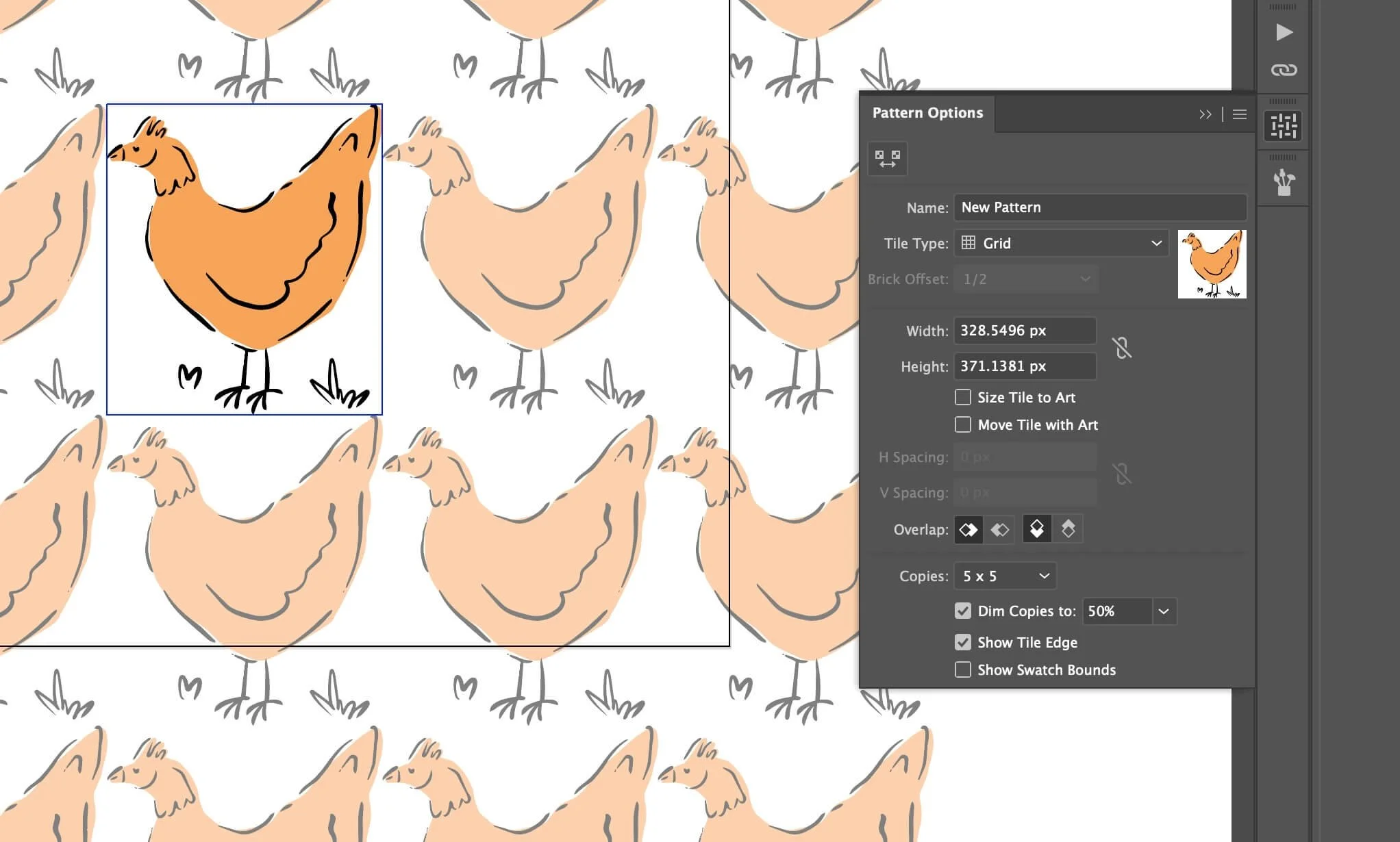
Pattern design by Kayla Ann | Image Source: astropad.com (10.10.2025)
Building a Manual Repeat for More Control
If you prefer to construct the repeat intentionally or are working with an older Illustrator version, the traditional move-and-copy approach is still a reliable method. Create a square tile with intentional dimensions, for example one thousand pixels by one thousand pixels. Any elements that are fully inside this boundary can remain untouched, but anything that sits on an edge must be duplicated across. To do this with precision, select the object and use the Transform → Move command. Enter the exact width or height of the tile, depending on which direction the object needs to reappear, and use Copy instead of OK. This places a perfect duplicate at the correct position without guesswork. Once all edge elements are mirrored appropriately, the tile is ready to be converted into a pattern swatch by dragging the grouped artwork into the Swatches panel.
Spacing and Visual Balance
People often focus heavily on the illustrative elements themselves and forget that negative space plays just as important a role. A well-made pattern allows the eye to travel comfortably without repeatedly getting stuck in the same place. If objects sit too close together, the pattern begins to feel crowded and restless. Too much space, and it loses rhythm. One way to evaluate spacing is to zoom out until individual shapes become less distinguishable. If certain areas appear heavier or emptier than others, make adjustments until the distribution feels balanced. Repetition should create flow, not distraction.
Keeping Colours Consistent
Once the layout is complete, refining colour choices can make the difference between a pattern that feels cohesive and one that appears hastily assembled. Rather than manually recolouring each element, it is better to set up Global Colours from the beginning or use the Recolor Artwork feature when adjustments are needed. This keeps the palette controlled and makes experimentation more efficient. A limited, well-curated set of colours usually creates a stronger visual identity than an accidental range of slightly different shades.

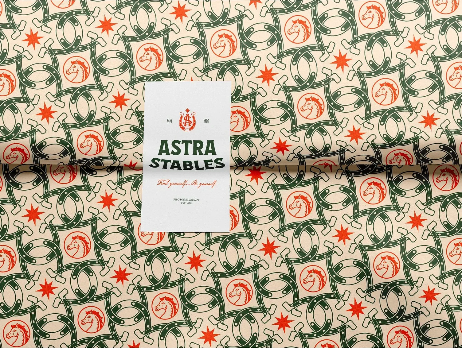
Pattern design by Maria Doncheva | Image Source: Maria Doncheva via Dribbble (10.10.2025)
Test in Multiple Orientations
Before finalising the tile, try rotating the entire composition. A design that looks convincing in one orientation might become less appealing when flipped or rotated ninety degrees. This helps reveal directional bias, awkward alignments or unintentional shapes formed by the positioning of objects. If it still feels cohesive no matter how it is viewed, it is more likely to translate well across different applications. It is also helpful to test the pattern at various scales. What feels balanced at full zoom might appear too busy or too sparse when applied to a smaller item such as packaging or stationery.
Knowing When It’s Finished
A seamless pattern is ready when its structure supports repetition without calling attention to itself. The edges should disappear completely when the tile is repeated. No area should draw focus unintentionally, and there should be no obvious starting or ending point. A reliable test is to apply the swatch to a large rectangle and view it as if it were already printed. If it feels natural and uninterrupted, the process has been successful.
Pattern design by Coric Design | Image Source: Coric Design via Dribbble (10.10.2025)
Using the Pattern Across Different Media
Once created, a good repeat can be applied almost anywhere. Digital uses include website backgrounds, social media graphics and presentation templates, while physical applications range from fabric and wallpaper to custom packaging and stationery. Because Illustrator patterns scale cleanly, they can be adapted easily depending on the medium. Saving alternate colour versions at this stage is also worthwhile, as it allows greater flexibility without rebuilding the tile from scratch.
Illustrator offers plenty of tools to make pattern creation easier, but features alone aren’t what make a pattern work — it comes down to structure, balance and intention. When those elements are handled well, repetition turns into something polished and usable across countless applications. And if you’d rather skip the trial and error altogether, I create seamless patterns professionally and would be happy to handle it for you. Whether you need a full collection or just one standout design, feel free to get in touch.