Tips for Better Social Media Graphics
Social media feeds are crowded—screaming, scrolling, swiping, blinking chaos. In that constant churn, your post has about three seconds (if that) to make someone stop and say, “Ooh, what’s this?” That’s where good design comes in. More specifically: graphics that are strategic, on-brand, and have a point.
This isn’t about making things “pretty.” It’s about visual communication that clicks—graphics that earn attention and engagement without relying on gimmicks or cat memes (unless your brand is cat memes, in which case: carry on). So, let’s talk about what makes a social media graphic work—from strategy and structure to style and scroll-stopping energy.
1. Start With the End in Mind
Every graphic should have a goal. Sounds obvious, but too often, people whip something up in Canva and post it just to “stay active.” That’s not a strategy—it’s noise. Are you announcing a new product? Sharing a behind-the-scenes moment? Driving people to your website? Asking a question? Start there. The purpose informs everything: the size, the colors, the call-to-action, and even the font choices. A “Buy Now” post looks and feels very different from a “Meet the Maker” moment. One’s urgent, the other’s intimate. If your graphic doesn’t support the message, it’s just decoration.
2. Design for Scrolling, Not a Gallery Wall
Design for mobile first. Assume your graphic will be seen in a 3-inch window while someone stands in line for coffee. That means:
Bold, readable type.
High contrast (especially for text-on-image).
A clear focal point.
Limited copy—just enough to intrigue or inform.
A common mistake? Treating social graphics like a flyer. No one’s squinting to read paragraph text on Instagram. Tease the message visually and save the details for the caption or a swipe-through carousel. Also: embrace white space. Crowded graphics = instant scroll-past.
3. Stay Consistent, Not Boring
Consistency builds recognition. Your audience should start to recognize your graphics without seeing your handle. That means sticking to a visual system: colors, fonts, layout styles, tone of voice. But that doesn’t mean everything has to look the same.
Think of your visual identity like a band’s album—not every song is identical, but they share a mood and style. Same with your social posts. If one day you’re posting pastel quote cards and the next you’re blasting neon glitch art… people are gonna get confused.

Social Media Kit for Balya | Click here see the full project © Vermeulen Design Studio
4. Make Engagement Easy
Design can encourage interaction, but you have to lead the way. Ask yourself: what do I want people to do after seeing this? Then make sure the graphic points them there. Use arrows, buttons (or button-like shapes), swipe prompts, and short calls-to-action (“Tap to shop,” “Save this for later,” “Tell us your favorite!”). Think of your graphic as a signpost, not a destination.
5. Format Matters More Than You Think
The same content can tank or take off depending on how it’s sized and formatted. Instagram stories love vertical. Carousels (multi-image posts) tend to drive more interaction. Twitter/X rewards sharp, meme-style visuals with bold headlines. Pinterest? That’s its own aesthetic universe. Match your design to the platform—don’t just repost the same square image everywhere. Even if it’s technically “optimized,” if it doesn’t feel native to the platform, it gets ignored.
6. Templates: Your Secret Weapon
Let’s be real: you don’t have time to custom-design every single post from scratch—and you shouldn’t have to. That’s where templates save the day. They help you stay consistent without losing your mind, and they make it way easier to keep your feed looking sharp and on-brand. Think in content categories—quote cards, product features, promos, FAQs—and build (or borrow!) templates for each.
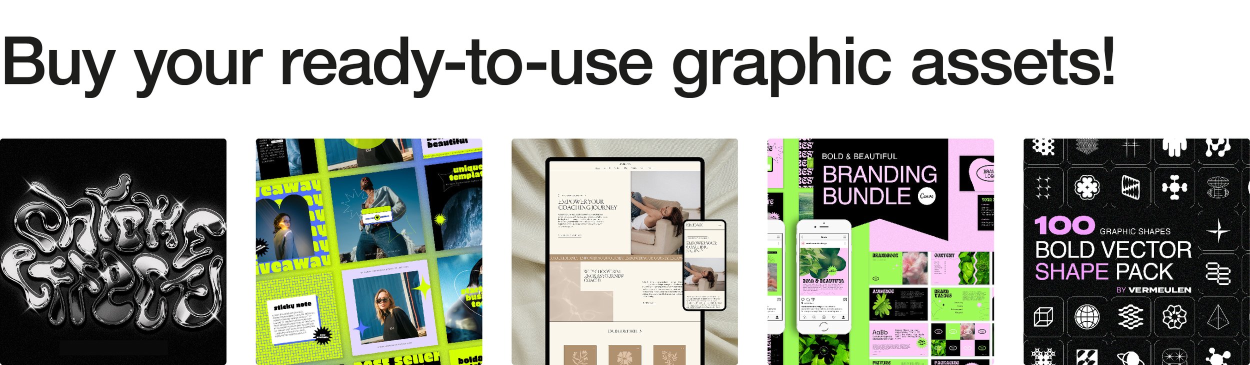
Speaking of borrowing: I’ve got a whole shop full of ready-to-use social media templates that you can customize 100% to match your brand. They’re designed to make your life easier, your grid prettier, and your engagement higher. Browse through, pick your favorites, and start posting like a pro—without the burnout.


7. Test, Don’t Guess
Good design is a process, not a one-hit wonder. Try different visuals and track what performs best. Maybe your followers love pastel palettes. Maybe bold red thumbnails tank your reach. Maybe posts with photos of hands holding products outperform styled flat lays. Pay attention to the metrics, but also read the room. What gets shared? What gets comments? What actually converts? Analytics + intuition = your creative compass.
8. Inject Some Personality
Too many brands play it safe on social—stock photo smiles, generic gradients, text like it’s been written by a committee of beige people. Yawn. Even if your business is serious, your graphics don’t have to be stiff. Use expressive typography. Toss in a handwritten arrow or doodle. Choose images that feel human. Speak like a real person (not a “brand voice guide”). People scroll through content—but they connect with personality.
Your social media graphics don’t need to win design awards. They need to communicate quickly, look like you, and make your audience want to interact. That’s it. But doing those things well—consistently, strategically, and with a dash of personality? That’s where the magic happens.
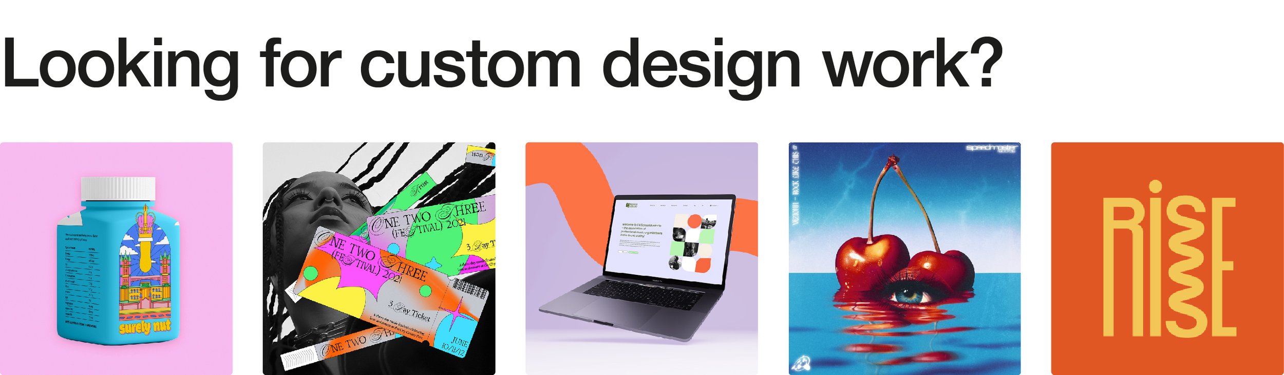
If you need a strategy for your social media visuals or want to upgrade your post templates, I can help. And if you're a designer looking for ready-to-use assets with a little flair, check out my shop—your Canva board will thank you.