Understanding Color Psychology in Design
Greetings design enthusiasts and color lovers! Have you ever wondered why certain colors evoke specific emotions and moods? Welcome to the captivating realm of color psychology in design, where colors transcend mere aesthetics to become powerful conveyors of emotions and perceptions. Let's embark on a journey through the palette and explore how colors can intricately shape the emotional landscape of your designs.
Breaking Down the Meanings Associated with Different Colors:
Colors, much like emotions, speak a language of their own. Here's a glimpse into the emotional dictionary of colors: Red, with its passionate and energetic vibes, exudes a sense of urgency, while blue, with its calm and serene aura, brings forth feelings of trust and tranquility. Yellow bursts forth with joy and optimism, like a splash of sunshine, while green embodies harmony, growth, and a connection with nature. Purple adds a touch of luxury, creativity, and mystery, while orange, radiating warmth and enthusiasm, demands attention with its vibrant energy.
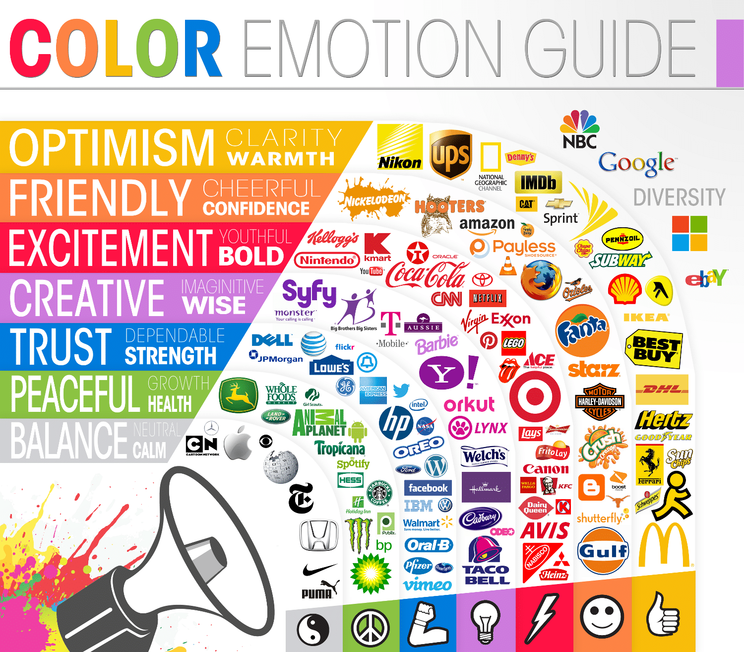
Color Emotion Guide | Image Source: The Logo Company (23/01/24)
The Cultural Implications of Color Choices:
However, colors don't have universal meanings; their interpretations vary across cultures. For instance: In Western cultures, white symbolizes purity, but in certain Eastern cultures, it's linked to mourning. Red may signify passion or danger in the West, but in Asian cultures, it represents luck and prosperity. The color black, associated with sophistication in the West, takes on a mourning connotation in some cultures.
Understanding these cultural nuances ensures that your color choices resonate positively with diverse audiences.
Guidance on Creating Harmonious Color Palettes:
Now, let's explore the art of crafting color palettes that harmonize seamlessly: Opt for analogous colors, those next to each other on the color wheel, for a calming, harmonious effect. Complementary colors, found opposite each other on the wheel, create vibrancy and contrast when used judiciously. Monochromatic color schemes, variations of a single hue, offer a sophisticated and cohesive aesthetic. Remember, it's not merely about choosing colors; it's about orchestrating a visual symphony that resonates authentically with your audience.
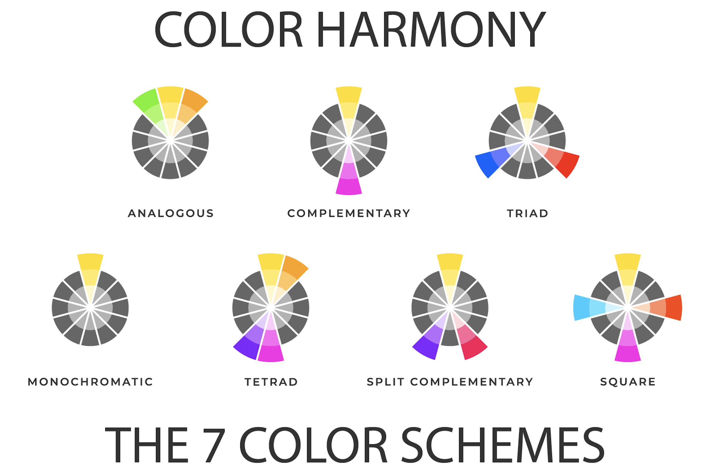
Color Harmony | Image Source: Color Meanings (23/01/24)
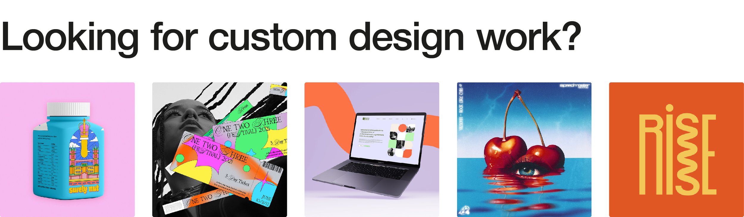
Ready to Infuse Your Design with Colors? Let’s Chat! If you’re eager to infuse your designs with the emotional depth of colors, I'm here to guide you! Explore my portfolio and let’s have a conversation about creating designs that speak a language of their own. Your vibrant design journey begins right here!