The ABCs of Typography
Hey design enthusiasts and font fanatics! Ever wondered why some words just look better than others? It's not magic – it's typography! We're diving headfirst into the world of fonts, decoding the secrets they hold, and learning how to pick the perfect ones for your design projects. Ready to make your words pop? Let's roll!
The Psychological Aspects of Fonts: Fonts have feelings too! Seriously, the typeface you choose can set the mood for your design. Here's the lowdown:
Serif vs. Sans Serif: Serif fonts (with little tails) often feel traditional and reliable, like a good book. Sans-serif fonts (without those tails) scream modern and sleek, perfect for a clean, contemporary vibe.
Script Fonts: Think cursive. Script fonts bring a touch of elegance and personal flair, perfect for invitations or fashion brands.
Bold and Playful: Big, bold fonts shout confidence and playfulness. Great for grabbing attention in posters or headings.
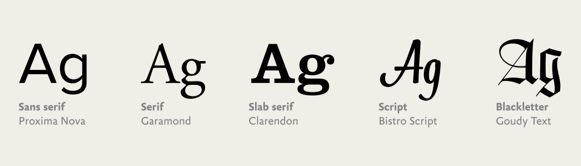
Typography Classifications | Image Source: San Serif © 2017 (23/01/24)
Font Combinations That Work Well Together: Mixing fonts is an art, not a science. Here are some combos that dance well together:
Serif + Sans Serif: Classic combo! Try pairing a bold sans-serif for headlines with a readable serif for body text.
Script + Sans Serif: Elegant meets modern. Think a cursive script for the name and a simple sans-serif for additional info.
Play with Sizes: Varying font sizes within the same family can add depth and hierarchy to your design.
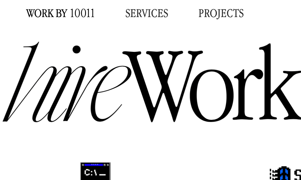
Examplary Font Combination | Image Source: Typewolf / © 2013 – 2024 Jeremiah Shoaf (23/01/24)
Readability and Choosing Fonts for Specific Contexts: Alright, let’s get practical about picking fonts:
Consider Your Audience: A funky, decorative font might work for a creative project but could be a headache for long reads.
Hierarchy Matters: Heading, subheading, body – each has a role. Make sure your font choices reflect the importance of each section.
Contrast is Key: Mix it up with font weights and styles for contrast. A bold headline paired with a light, airy body font creates visual interest.
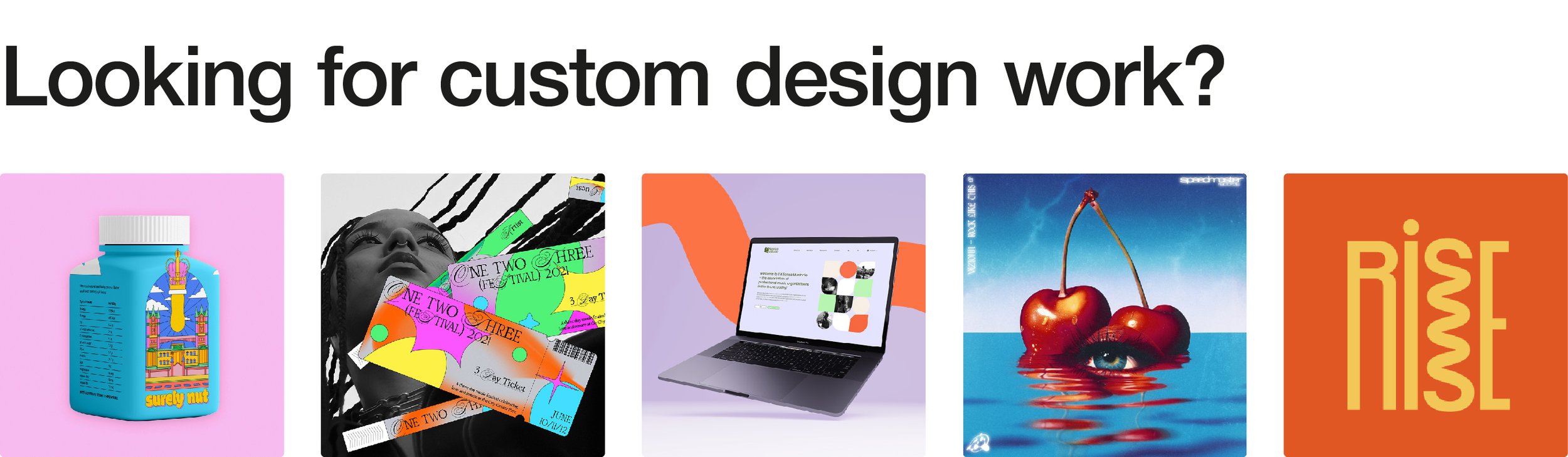
Ready to Transform Your Design with Fonts? Let’s Chat! If you're itching to play with fonts but need a design buddy, I'm here for you! Check out my portfolio and let’s talk about creating a design that speaks volumes through its fonts. Your typography adventure starts here!