Pantone Explained: How a Color System Became the Industry Standard
Pantone isn’t just a color brand. It’s the color brand. For decades, designers, printers, and manufacturers have relied on Pantone’s system to make sure that what’s seafoam green in New York doesn’t look like toxic mint in Tokyo. But lately, the name Pantone has sparked as much eye-rolling as it does admiration. Why? Because behind the pretty swatches is a business model that’s both genius and, depending on who you ask, a little greedy.
This article breaks down how Pantone works, why it's been catching some heat recently, and why—despite everything—it’s still a beautifully efficient system. Think of it as a love letter with footnotes.
What Even Is Pantone?
At its core, Pantone is a standardized color matching system. The goal is simple: make sure that a specific color looks the same no matter where, how, or when it’s printed. Whether you're designing lipstick packaging or a billboard in 10 languages, Pantone helps ensure consistent color output across materials, printers, and borders.
Each Pantone color is identified by a unique code (think: PANTONE 186 C), making communication between designers and printers a lot less prone to chaos. Instead of saying “a slightly muted but not dull red,” you just say “Pantone 186 C,” and the printer knows exactly what you mean. Zero ambiguity. No arguments.
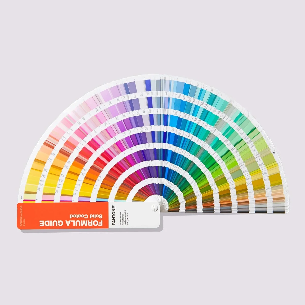
Pantone Solid Coated Formula Guide | Image Source: © Pantone LLC, 1995 - 2025 (02/05/25)
So How Does Pantone Make Money?
Here’s where it gets a bit spicy. Pantone makes its money in a few key ways:
Swatch books and guides: Designers and printers need these physical books to see accurate representations of colors. They’re not cheap, and according to Pantone, you’re supposed to replace them every six months to ensure color accuracy. Paper degrades, inks fade, and over time your trusty swatch book might be giving you slightly off tones—so if you're aiming for precision, Pantone wants you freshening up that guide twice a year.
Licensing: Want Pantone colors in your software? Adobe, CAD tools, and printing software often have to license those color libraries from Pantone. This got extra messy in recent years—more on that below.
Merch and collabs: Pantone is a lifestyle brand too. They’ve done everything from mugs to sneakers, sometimes in slightly absurd “Color of the Year” tie-ins. (Millennial Pink walked so Viva Magenta could run.)
This business model isn’t unusual—it’s textbook proprietary intellectual property. But it’s also the root of a lot of criticism.
Why Do People Criticize Pantone?
Design Twitter (and Reddit, and basically every design forum) occasionally erupts into full-on chaos when Pantone makes a move. Here’s why:
Adobe Integration Drama: In 2022, Pantone decided to pull its color libraries from Adobe Creative Cloud unless users paid for a separate Pantone subscription. This left designers staring at “color not available” errors or black boxes in old files unless they ponied up.
Needless to say, people were… not thrilled. Many felt like they were being charged twice for something they already paid for. It felt like being locked out of your own living room and told you need a new key—available for $15 a month.Pricey Updates: Pantone color books cost hundreds of dollars. And while colors don’t exactly “expire,” paper degrades, and Pantone nudges users to buy fresh swatches every six months. Some argue this model is unnecessarily expensive for freelancers and small studios.
Closed System: Pantone’s system is proprietary, meaning you can't legally reproduce the color values or publish them outside their system. Open-source and indie designers often find this restrictive in an era that increasingly values transparency and accessibility.

Pantone Pride Espresso Cup Set | Image Source: © Pantone LLC, 1995 - 2025 (02/05/25)
Why Pantone Still Rocks (Yes, Really)
Despite all the above, Pantone is still a fantastic system when you look at what it actually does. Pantone brings clarity to the often-messy world of color. On a screen, colors are subjective and can vary wildly depending on the display, but Pantone eliminates that guesswork when it comes to physical production. Its system is universal—whether you’re referencing a swatch in Berlin, Buenos Aires, or Bangkok, the end result will look the same. Even more impressively, Pantone achieves cross-material accuracy. Pantone 285 on paper looks like Pantone 285 on plastic, which might not sound like much, but in the world of print and product design, that level of consistency is pure gold.
And let’s be honest: nobody else does what Pantone does quite as thoroughly or at the same scale. CMYK and RGB have their place, sure, but for spot color work and branding that demands consistency, Pantone still rules.
Real-Life Examples of Pantone in Action
Let’s say you’re branding a coffee shop chain. You pick a rich forest green as your signature color. You want that green to be exactly the same on your printed menus, takeaway cups, signage, staff uniforms, social media headers—you name it.
You could try to match it in CMYK every time, but that’s a nightmare of trial and error. Or you could just pick Pantone 3425 C, hand that number to every vendor you work with, and move on with your life. That’s the magic of standardization.
Some of the most iconic brand colors are tied directly to Pantone. Coca-Cola Red, for instance, is a custom Pantone color created to maintain consistency across every can, billboard, and branded fridge on the planet. Tiffany Blue is so distinctive it’s not only Pantone-matched but also trademarked. And then there’s Pantone’s Color of the Year—a brilliant bit of marketing that manages to influence everything from fashion runways to home décor and product packaging, all with a single swatch.

Pantone Color of the Year 2025 | Image Source: © Pantone LLC, 1995 - 2025 (02/05/25)
Is It Worth It?
If you’re running a large brand, working in packaging, or need absolute color control, the answer is yes. The cost of Pantone tools is minimal compared to the risk of inconsistent results.
If you’re a solo designer doing mostly digital work, the case is less clear-cut. You might be able to get by with open-source color tools and good ol’ CMYK or RGB—though you’ll need to double-check how colors appear in print.
So Where Does That Leave Us?
Pantone isn’t perfect. It’s a closed system in an open-source world, and it knows exactly how valuable its monopoly is. But for professionals who care about precision and consistency, there’s still no better option. Just like Helvetica or coffee, we can gripe about it all day—but we still use it.
Pantone sits at the intersection of color science, design culture, and clever marketing. It’s a tool, a brand, and—occasionally—a bit of a nuisance. But it works. And at the end of the day, when your colors come out just right, it’s worth every carefully calibrated swatch.