How to Create Culturally Responsive Designs
Design is a powerful tool. It sells, informs, inspires—and whether we like it or not, it also sends signals about who we think our audience is and how we see the world. When it comes to culture, though, design can do more than just send signals. It can build bridges—or burn them, if handled carelessly.
Culturally responsive design is about making visual choices that respect, represent, and reflect diverse perspectives—without turning them into caricatures. It’s not about walking on eggshells or playing it safe. It’s about being smart, thoughtful, and responsible with the images, typography, language, and references we put out into the world.
So how do you avoid stereotypes and celebrate diversity without ending up with a moodboard that looks like a tourism brochure from 1997? Let’s break it down.
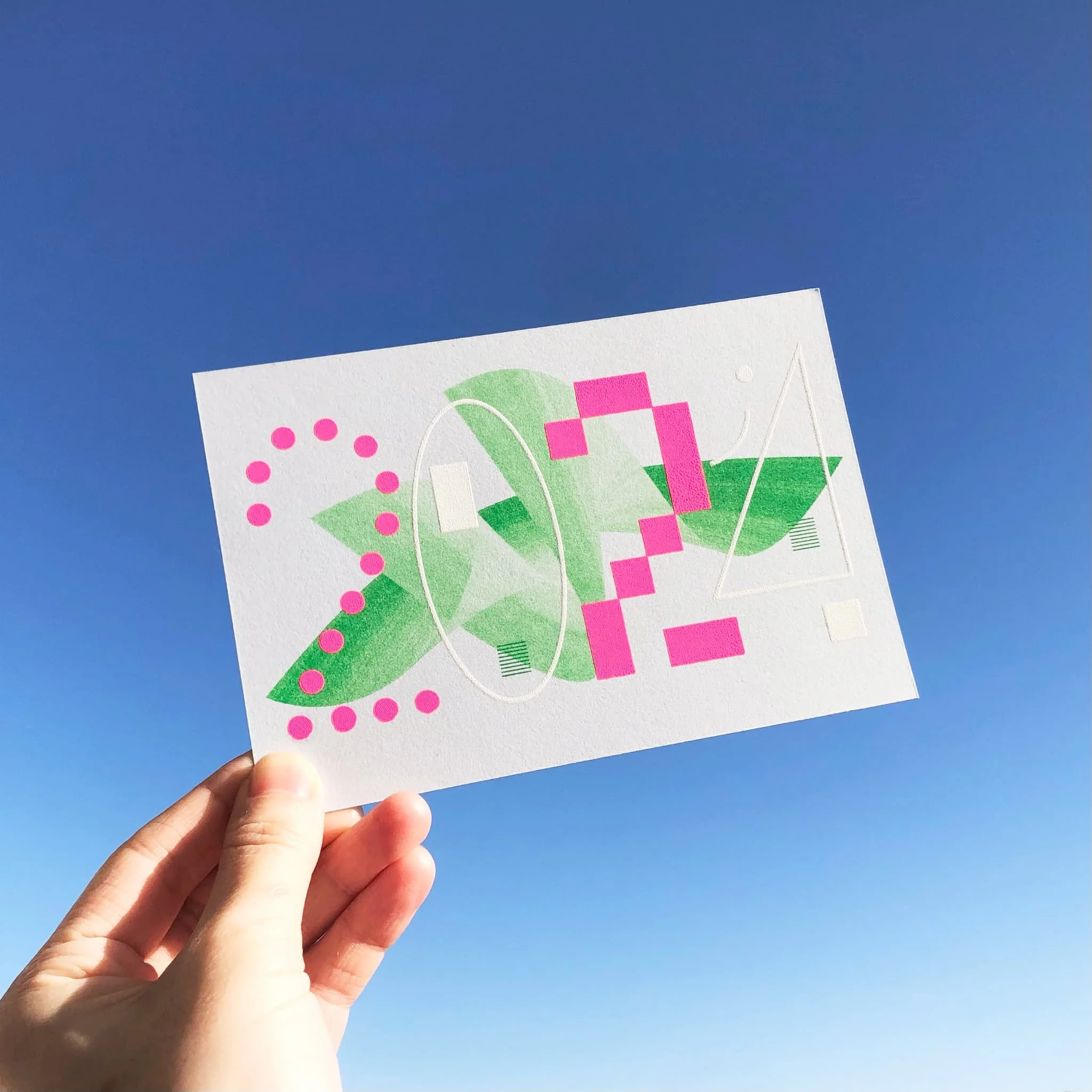
2024 New Year’s Card by Japanese Designer Mami Shimizu | Image Source: Mami Shimizu (09/05/25)
Culture Isn’t a Costume
One of the most common mistakes designers make—especially when trying to be “inclusive”—is reducing culture to aesthetics. Think sombreros and tacos for “Mexican,” or cherry blossoms and calligraphy for “Asian.” It’s not that those things aren’t real; they’re just overused shorthand, and they flatten rich, living cultures into decorative clichés.
Real cultural representation starts with context. Instead of pulling from surface-level visuals, look at how people from those cultures represent themselves. What colors are actually used in contemporary African design? What typography trends are coming out of Southeast Asia? What local illustrators, photographers, and type designers are shaping the visual landscape? The goal isn’t to mimic, but to listen, learn, and incorporate respectfully.
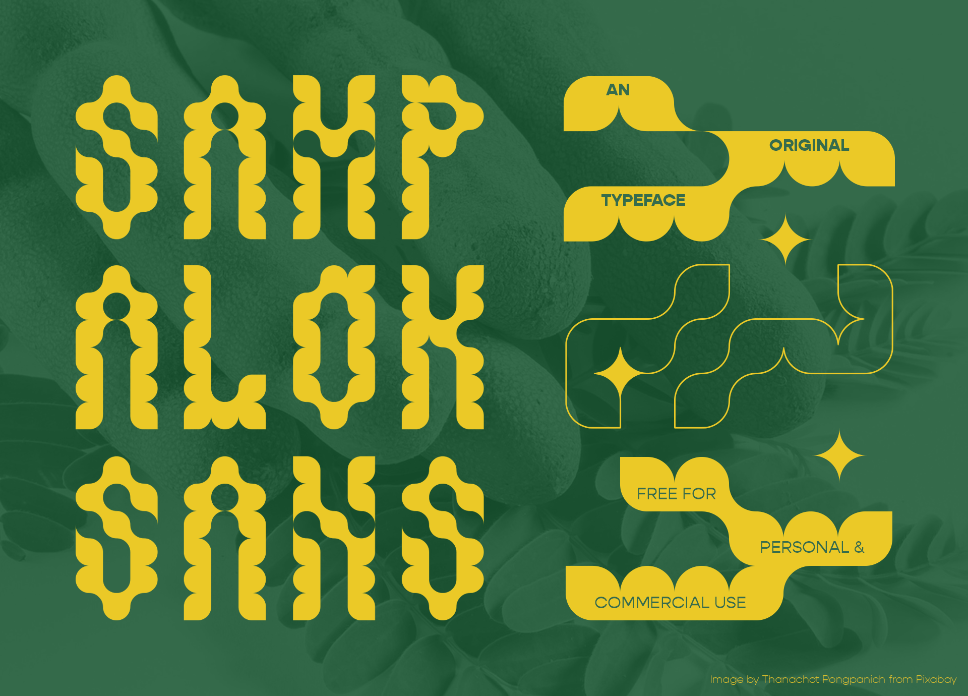
Sampalok Sans – a Font inspired by Tamarind by Filipino Designer Jacob Banog | Image Source: Behance/Jacob Banog (09/05/25)
Do the Homework (Yes, Every Time)
Designing for a specific culture—or designing something that will be seen by a global audience—means you need to do a bit of research. Not Wikipedia-skimming levels of research. Actual research.
If you're designing a campaign for a holiday you don’t personally celebrate, make sure you understand its meaning beyond the Pinterest aesthetic. If you're creating visuals for a market outside your own, involve people who live and work there. Ask questions, seek feedback, and don’t assume Google Translate is your friend (especially when it comes to typographic treatments—some languages do not like being squished into square Western layouts).
Even color can be tricky. Red means luck in China. In South Africa, it’s associated with mourning. Context is everything, and assuming your palette, symbolism, or visual metaphors are “universal” is where the trouble starts.
Stereotypes vs. Specificity
A stereotype is a lazy shortcut. Specificity is a sign of care. Let’s say you’re designing a poster for a multicultural event. Instead of defaulting to flags, folk patterns, or “ethnic-looking” fonts (please, just don’t), focus on what the event is actually about. Who’s involved? What are the stories being shared? What’s the atmosphere, the energy? Draw from that.
Specificity helps audiences feel seen, because it shows you didn’t just lump their culture into a moodboard of spicy food, elephants, and vaguely tribal patterns. It also leads to more original design. Win-win.
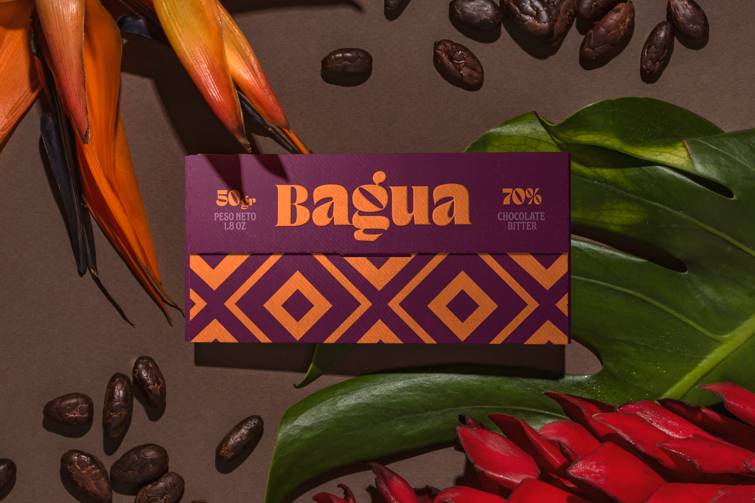
‘Bagua’ Packaging Design for Peruvian Chocolate Company by Fibra Branding | Image Source: Behance/Bagua (09/05/25)
Representation Means Teamwork
If you want to represent diverse audiences, your process needs to be inclusive too. This is where collaboration comes in. Hire illustrators from the communities you’re trying to represent. Use fonts made by designers from those cultures. Better yet, ask them to be part of the creative process entirely.
No one person can know everything, and that's fine. That’s why diverse teams make better design—because they spot things others miss. Representation isn't about “getting it right” on your own. It's about building a project that brings in more perspectives from the start.
The Intent Isn’t Enough
Even with the best intentions, you can still get it wrong. And that’s okay—if you're open to feedback and willing to improve. Intent matters, but impact matters more. If someone from the community you're designing for says something feels off, listen. Take it seriously. Learn.
Getting defensive helps no one. Culturally responsive design isn’t a checklist. It’s an ongoing practice of awareness and humility. You’re not going to ace it on the first try—but trying matters, and trying thoughtfully matters even more.
So What’s the Takeaway?
Culturally responsive design isn’t a trend. It’s a necessity in a globalized, connected world. People want to see themselves represented accurately—not just included as visual afterthoughts. That means more than picking the right photo or font. It means asking better questions, digging a little deeper, and inviting more people to the design table.
When we treat culture with respect and curiosity—not as a branding device, but as a rich, complex reality—we make better design. More meaningful design. Design that actually connects. And that’s the whole point, right?
Need help making your design work more inclusive—and still look amazing? I specialize in crafting brand visuals that are authentic, thoughtful, and creative (without the clichés). Whether you're a global brand, a small business, or just someone who wants to get this stuff right, I can help. Let’s build something that truly resonates—with everyone.