Navigating the Multi-Device Era: Responsive Web Design Unveiled
Hey digital trailblazers! Ever tried accessing a website on your phone and found yourself zooming in, zooming out, and doing the touchscreen dance? Welcome to the era of responsive web design – the superhero of the multi-device landscape. Let's chat about why it matters and how you can ensure your website shines on every screen. Ready to ride the wave of responsiveness? Let's dive in!
The Concept of Responsive Design:
Responsive design is the secret sauce behind a website that looks just as stunning on your laptop as it does on your phone or tablet. It's like having a shape-shifting website that adapts to the size of your screen. No more pinching and zooming – the content elegantly rearranges itself to fit any device, creating a seamless and enjoyable user experience.
Coding and Design Tips for Responsiveness:
Alright, let’s get our hands a bit dirty (but just a bit, promise!).
Flexible Grid Layouts: Design your site with a flexible grid system, so elements proportionally adjust based on the screen size.
Media Queries: Use media queries in your CSS to apply different styles for different devices. It’s like giving your website a wardrobe for each occasion.
Optimize Images: Nobody likes pixelated or slow-loading images. Optimize and compress your images to ensure a smooth experience, especially on mobile devices.
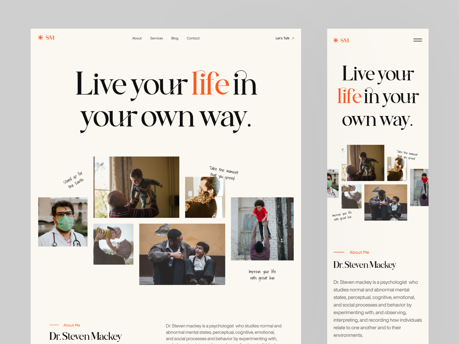
Example of a Responsive Website | Image Source: © Najmul Hasan (30/01/24)
Websites with Excellent Responsive Design:
The proof is in the pudding! Here are a couple of websites acing the responsive game:
BBC News: Check it out on your desktop, then switch to your phone. Notice how the layout adjusts seamlessly, ensuring a comfortable reading experience.
Airbnb: Whether you're browsing for a vacation spot on your laptop or checking it out on your tablet, Airbnb's website ensures a consistent and visually pleasing experience.
Ready to Elevate Your Website’s Game? Let’s Chat! If you’re ready to make your website a responsive rockstar, I’m your design guide! Explore my portfolio and let’s discuss turning your website into a flexible, user-friendly masterpiece. Your journey to responsive greatness begins here!
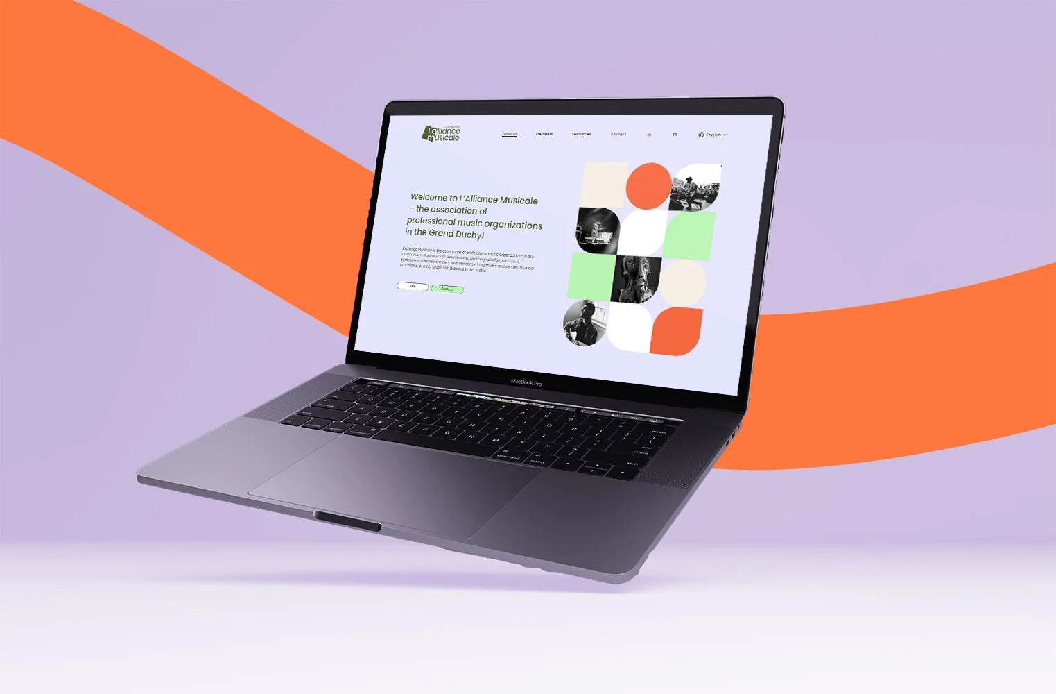
Image Source: © Vermeulen Design Studio
Dear digital pioneers, responsive design isn’t just a trend; it's a necessity. In a world where screens come in all shapes and sizes, ensuring your website adapts effortlessly is the key to capturing hearts (and clicks). So, gear up, embrace responsiveness, and let your website shine on every device. Here’s to a digital landscape where every screen is a stage for your online brilliance!