The Revival of Maximalism
Minimalism had a good run. For years, design has tiptoed quietly across the page—muted palettes, clean grids, negative space so generous it should’ve charged rent. And while that polished, pared-down aesthetic still has its place, there's been a serious mood shift in the design world lately. Cue the confetti, clashy patterns, and an unapologetic love of “too much.” Maximalism is back—and it’s louder, richer, and more visually chaotic (in a good way) than ever.

Branding and Ticket Design for ‘One Two Three Festival’ © Vermeulen Design Studio
Why Maximalism Is Making a Comeback
Let’s be honest, the past few years have been... a lot. People are craving personality, comfort, nostalgia, and color—things that minimalist design just isn’t built to deliver. Maximalism, on the other hand, wraps you in a velvet blanket of saturated hues, vintage textures, ornate type, and layered storytelling. It’s the visual equivalent of a really good secondhand bookstore or a Wes Anderson film: quirky, indulgent, and full of character.
There’s also a generational factor. Gen Z, in particular, seems to have had enough of “curated feeds” and grayscale aesthetics. They grew up with memes, early internet chaos, and hyper-personalised digital spaces, so it's no surprise that their visual language leans toward more-is-more. Maximalism celebrates individuality and breaks the rules. It says: “Yes, you can use leopard print, neon green, and serif type all on the same page—and no, I will not be toning it down.”
What Defines Maximalist Design?
At its core, maximalism is a love letter to excess—but it's not about being sloppy or incoherent. When done right, it’s a masterclass in controlled chaos. Think bold color palettes that challenge your comfort zone, intricate patterns layered like a textile collage, and typefaces that scream personality.
Texture plays a huge role. From grainy gradients to overlaid paper scans, maximalist design isn’t afraid to feel tactile. It also borrows heavily from different eras—Art Deco, Y2K, Memphis, punk zines—and fuses them together like a thrift store haul turned inside out.
Typography is another major player. In minimalist design, fonts tend to be silent partners. In maximalism, they’re front and center. We’re seeing wild pairings of serif and sans, script and monospace, decorative type used in ways that make designers half-laugh, half-cry. Fonts are often oversized, overlapping, twisted, or squeezed into strange shapes, adding to the visual drama.


Personal Project by Stxrling Stxdio | Image Source: stxrlingstxdio.com (23/05/25)
Maximalism in Practice: Examples Worth Noting
One of the most iconic examples of modern maximalism is Gucci's visual rebrand over the past few years. Under the creative direction of Alessandro Michele, the fashion house went full throttle with eclectic visuals—think embroidered tigers, Renaissance paintings, clashing patterns, and serif-heavy layouts that look like old Italian newspapers on acid.
In the digital space, look at the branding of platforms like Adult Swim or even websites like The Outline. These brands didn’t just embrace maximalism—they weaponized it. Bold colors, jarring layouts, animated text, intentional over-design—it’s all there, and it all works because it’s done with conviction.
Designers like Leta Sobierajski and Wade Jeffree have also been pushing the boundaries of visual maximalism, blending physical materials with wild digital textures, setting typography in ways that make your brain do somersaults (in a good way).
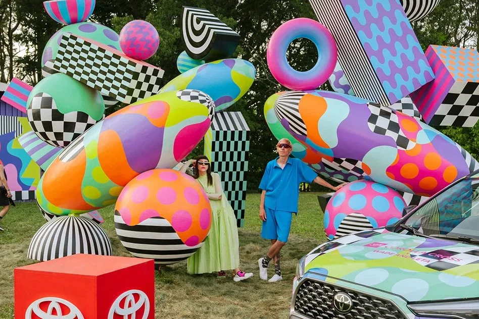
Toyota x Wade and Leta: Paint Your Own Path | Image Source: Behance/Leta Sobierajski (23/05/25)
Is There a Method to the Madness?
Absolutely. Maximalism isn’t about cramming everything into a canvas and hoping it works out. It requires taste, restraint (ironically), and the ability to layer elements with intention. Successful maximalist design understands hierarchy—what you want the viewer to look at first, second, third. It also relies on a strong grasp of contrast, balance, and repetition, even if it doesn’t look that way at first glance.
It’s the visual equivalent of a maximalist home—yes, the walls are covered in art, there are five types of seating and a lava lamp, but somehow, it’s cohesive. There’s a difference between clutter and curation, and maximalist design knows where that line is.
How to Use Maximalism Without Losing Your Mind
If you're tempted to lean into this trend but aren’t quite ready to say goodbye to your beloved whitespace, try starting small. Use a bold typeface for one element. Add a textured background. Try layering your graphics. Play with unexpected font pairings. Break your own design habits and see what feels exciting.
Maximalism isn’t about abandoning structure—it’s about finding a different kind of order in the visual noise. And once you start seeing the possibilities, it’s hard to go back to Helvetica on a white canvas ever again.
Design is cyclical, and maximalism might not be for everyone—but right now, it feels like a breath of fresh air. Or maybe a neon-scented, glitter-coated, vintage-cassette-tape-sounding breath of air. Either way, it’s fun, and that’s something the design world could use a little more of.
If you’re feeling inspired to try a maximalist approach in your own work but don’t know where to start—or just want someone who knows how to juggle seven typefaces without causing a design catastrophe—let’s talk. I love bringing layered, personality-packed designs to life. And yes, I can help you go full maximalist without making it look like a visual meltdown.