Why Your Brand Needs a Visual System (Not Just a Logo)
There’s a recurring pattern in the world of small businesses: someone gets a shiny new logo, uploads it proudly to their Instagram bio, maybe slaps it onto a business card template, and then… nothing quite matches ever again. The website uses a slightly warmer shade of blue because “it looked nicer,” the social media posts switch fonts weekly depending on mood, and the printed flyers somehow always turn out darker than expected. The logo becomes a lonely island, surrounded by design decisions that don’t really speak the same language. It’s not the business owner’s fault — most people are told they need a logo, but almost nobody tells them they need the rest of the system that makes the logo actually work. And without that system, even a beautifully designed mark doesn’t do much heavy lifting.
A brand visual system is the backbone — or honestly, the entire skeleton — that gives a brand structure, consistency, and recognizability. It’s the collection of rules, decisions, and design elements that support the logo rather than leaving it to fend for itself. And while this might sound a bit dramatic, the truth is that the brands you admire most aren’t memorable because of their logo alone. They’re memorable because everything they put into the world feels unmistakably theirs, even when the logo isn’t visible. A visual system is what makes that possible.
Logos Are Not Magic
A logo is a symbol. That’s it. On its own, it can’t tell your entire story or communicate your brand values in every scenario. A logo is the front door, not the whole house. If a brand only relies on its logo for recognition, it ends up needing to plaster it everywhere — giant headers, oversized placement, watermarking like it’s 2007 — just to make sure people “get it.” Good brands don’t need to shout like that, because their style is already clear through color, typography, layout, illustration style, and tone.
Think of your favorite brands. You’d recognize Apple even if the logo wasn’t there. You’d know Glossier from a single shade of millennial pink and that soft, glossy finish. You’d spot IKEA from a mile away because their blue and yellow combo is as committed as a long-term marriage. Their logo isn’t doing all the work — everything else supports it. That’s the difference between design and visual identity. One is a mark. The other is the entire language. Your brand deserves a language, not just a word.
Consistency Builds Trust And Trust Builds Sales
Consistency sounds like the most boring advice on the planet, but it’s the backbone of brand trust. When everything looks cohesive, customers assume the business behind it is professional, reliable, and intentional. When everything looks mismatched, chaotic, or cobbled together from free templates… well, people notice. They may not articulate it, but they feel it. Visual inconsistency triggers doubt. Doubt makes people hesitate. Hesitation loses sales.
A visual system removes that guesswork. It ensures that no matter who is designing what — you, an intern, a freelancer, your cousin who “knows Canva a little,” or a future team — the materials feel unified. The fonts are the same. The colors match. The hierarchy is predictable. The imagery fits. The layouts echo each other. And suddenly, the brand feels stable. When something feels stable, it feels safe. When something feels safe, people buy.
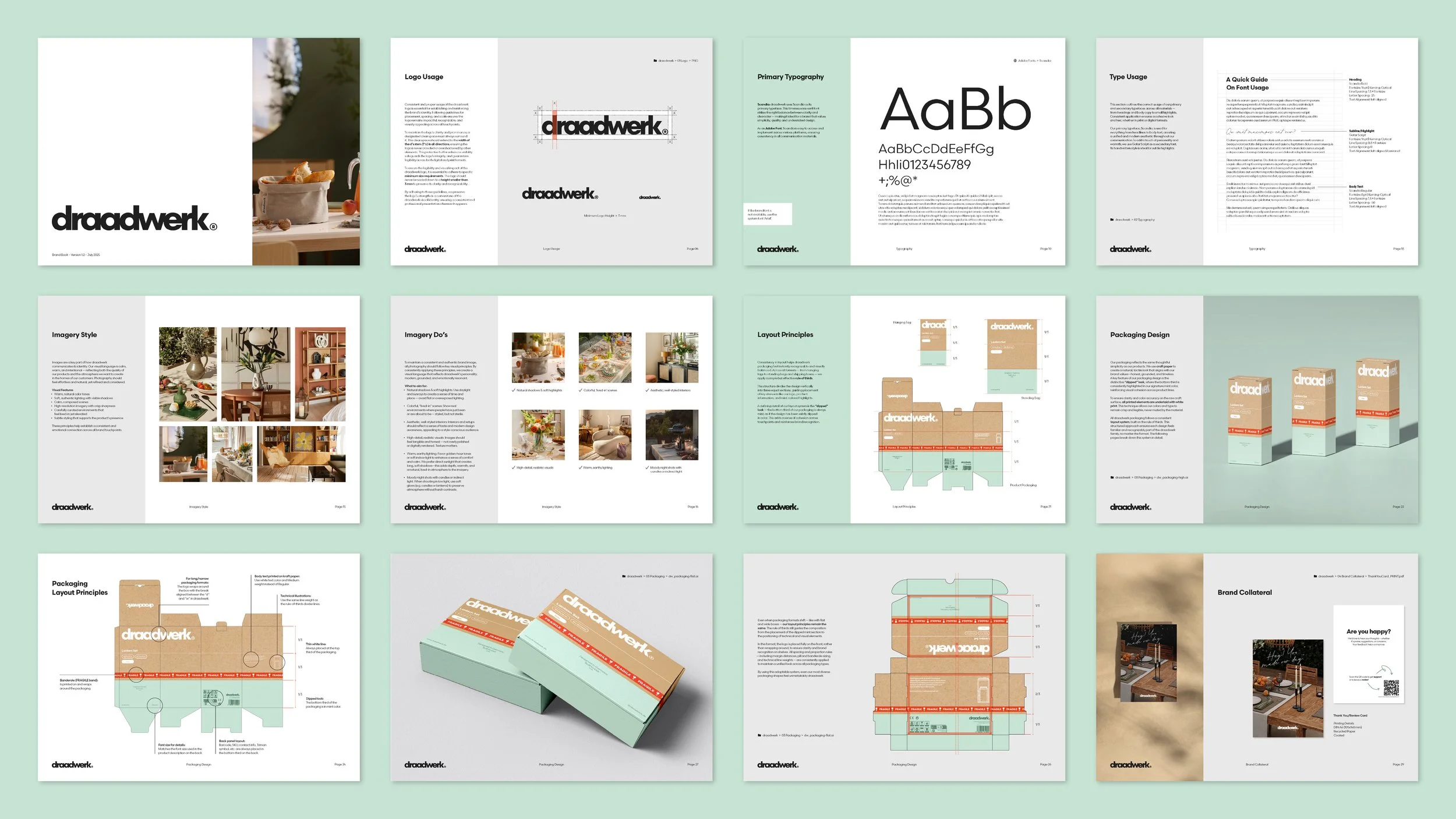
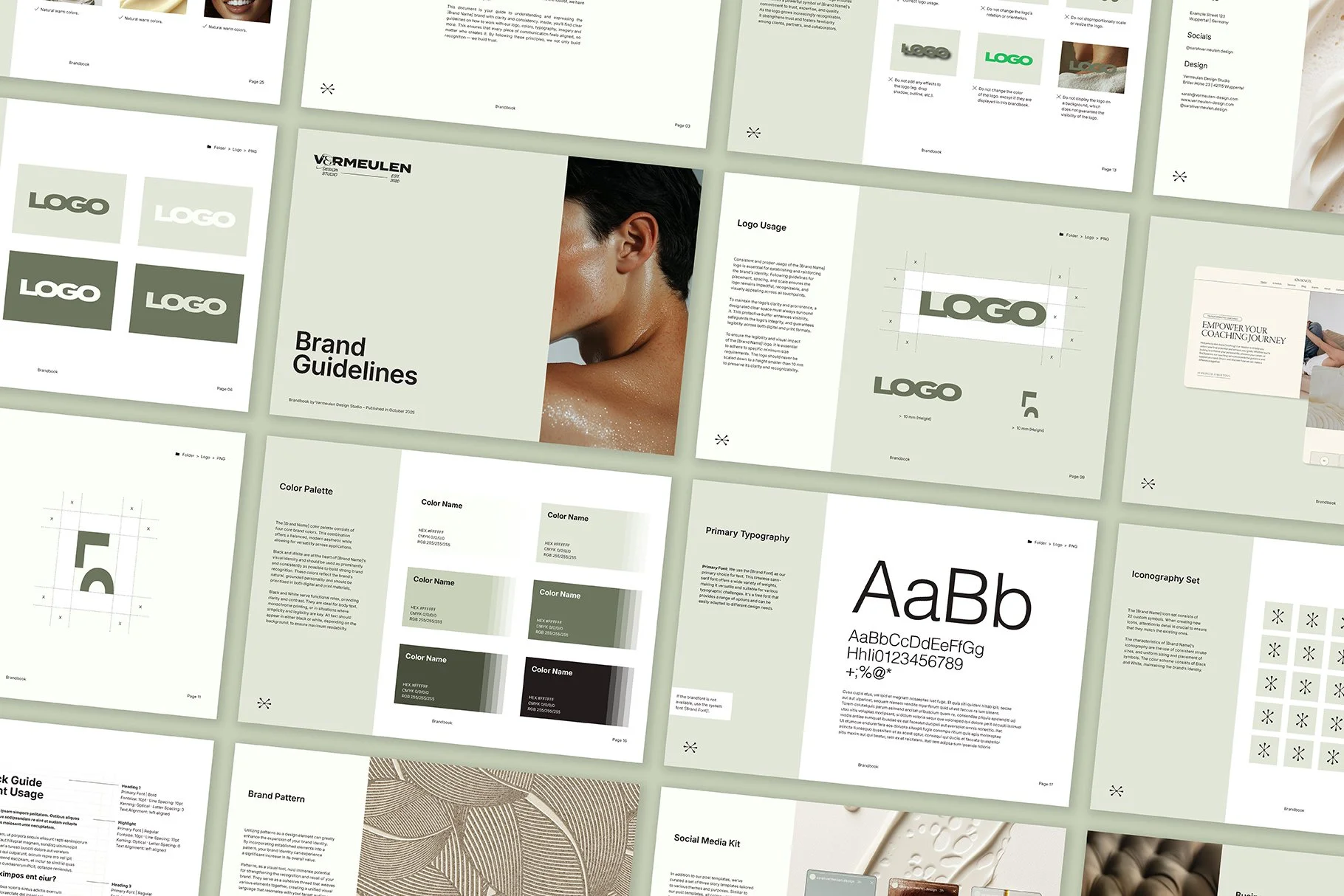
Brandbook for draadwerk® | Click here see the full project © Vermeulen Design Studio
Color, Type, and Layout: Your Brand’s Personality in Action
Colors carry emotional weight. Typography sets tone. Layout influences perception. When these elements aren’t defined, everything becomes improvisation, and improvisation is the enemy of consistency — at least in branding. A well-crafted visual system clearly defines your brand’s personality, and not in a vague “playful but modern” kind of way. Instead, it becomes a toolkit of usable, repeatable rules.
Color palettes prevent mismatches in print and digital. Typographic guidelines ensure that your headings don’t suddenly switch from elegant to eccentric because someone liked a “fun font.” Layout rules dictate how elements are arranged so your designs stop feeling unpredictable. All of this works together to reinforce the message you want people to associate with you. Without those guidelines, every piece of content becomes a visual roll of the dice. Some days, the results look intentional. Other days, they look like a random Pinterest mood swing.
Recognition Comes from Repetition, Not Reinvention
Many brands struggle because they keep reinventing their visuals every time they create something new. New colors one week, new layouts the next, and an ever-shifting approach that makes it impossible for customers to memorize anything long-term. Visual recognition isn’t built through innovation — it’s built through repetition.
A strong visual system gives you a foundation that doesn’t need constant reinvention. Instead, it becomes something you refine over time. Your audience learns to recognize your brand from small cues: the way you crop images, the line thickness in your icons, the spacing of your headlines, even the specific kind of texture or shape you use.
When your brand becomes recognizable without its logo, that’s when you’ve achieved visual maturity. People start associating you with a mood, a style, a feeling. And once your brand becomes a feeling, it becomes memorable.
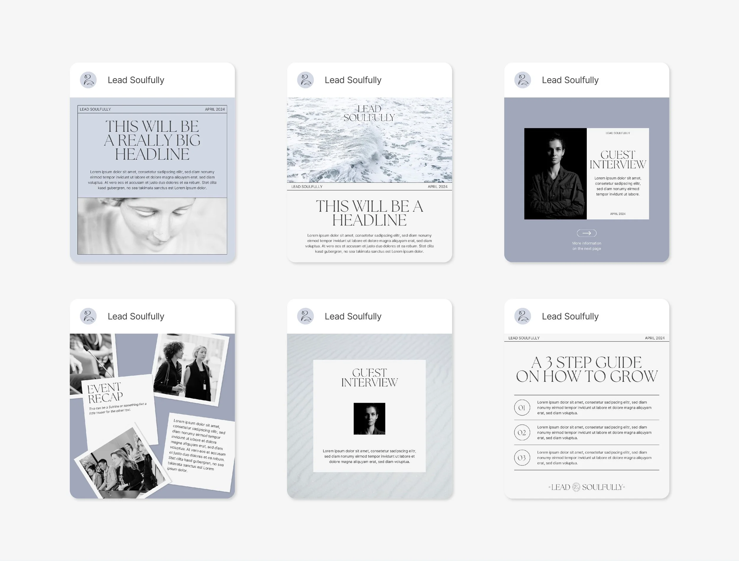
Brand Design for Lead Soulfully | Click here see the full project © Vermeulen Design Studio
A Visual System Saves You Time (And Honestly, A Lot of Frustration)
Here’s the part business owners don’t expect: a visual system doesn’t just make your brand better — it makes your life easier. Creating content becomes significantly faster because you’re not reinventing the wheel every time. You’re not debating which font to use or which shade of blue feels right today. You’re not trying twelve different layouts in Canva hoping one of them won’t look “off.” You already know the rules. You know what works. Decisions are made once, not every day.
This is also where templates come in handy. When your system is defined, templates multiply your efficiency. They give you ready-to-use structures that keep everything consistent and on-brand without effort. And when you want to scale your visual presence — posting more often, expanding your website, creating more marketing materials — you won’t feel overwhelmed, because your system carries the workload.
Your Brand Deserves More Than a Lone Logo
A visual system is not just a nice-to-have. It’s the framework that keeps your brand coherent, memorable, and trustworthy. It’s the thing that ensures your marketing materials don’t feel like they were designed by six different people across three different decades. It’s the secret ingredient behind brands that feel professional even before you know anything about the business itself. If your brand feels inconsistent, chaotic, or constantly changing, the issue isn’t that you need a better logo. You need the rest of the system that supports it.
And if you want help building that system — whether it’s branding, templates, or visual guidelines — this is exactly the kind of work I do. A strong visual system doesn’t just make your brand look better; it makes your business run smoother. If you’re ready to give your brand the structure it deserves, I’m here to help.
If hiring someone to build your full visual system isn’t in the budget right now, you don’t have to wander around in design chaos. I created a brandbook template that gives you a solid starting point — clear, simple, and structured — so you can build your own rules without getting lost in the sauce.